Ranked #1 most-searched fashion brand on Google in 2018 and top-6 most visited websites by young consumers, Fashion Nova stands alongside Gucci, Louis Vuitton, Supreme, and Chanel as one of the world's most recognized apparel brands.


WHAT IS FASHION NOVA - VENDOR PORTAL
All vendors who sell items on the Fashion Nova e-commerce website have access to the Vendor Portal web app where they can manage purchases, invoices, payments, deliveries, and credits for their businesses.
The Vendor Portal provides access to high quality information that is key to synchronize the production and supply chain, estimate monthly sales, analyze trends, and guide the decision-making process of managers.
THE GOAL
The original Vendor Portal was built as an MVP, functional, but not scalable. With a growing vendor base and increasing operational complexity, Fashion Nova needed a partner to audit the existing product, close the gaps, and deliver a production-ready platform.
1. Redesign core workflows
Rebuild key vendor journeys end-to-end: purchase orders, invoices, deliveries, payments, and credits.
2. Introduce data visibility
Replace static XML exports with interactive dashboards, custom filters, and real-time reporting.
3. Build for scale
Establish a design system to standardize the UI and reduce future feature delivery time.
MY TEAM
1 Client Stakeholder
1 Business Developer
3 Web Developers
Myself as UI-UX Designer
MY ROLE
I owned the end-to-end redesign from audit to shipped product. Reported directly to the Senior PM. I led a cross-functional team of 3 developers. Our client stakeholder was embedded at the Fashion Nova warehouse in direct contact with end users. I drove prioritization, managed stakeholder reviews, and made the key design decisions that shaped the final product.

PRIORITIZATION & ROADMAP
Using Jira, the Development Team and I wrote the user-stories, sub-tasks, and dependencies. This allowed my team to identify blockers, dependencies, and the specific planning in order to be completed on time.
THE CHALLENGE
Scope was broad, timeline was tight, and the team was small. User journeys required simultaneous input from developers and the client stakeholder two parties with different cadences and priorities. The risk was a bottleneck: design waiting on feedback, development waiting on design.
MY SOLUTION
I introduced a dual-track design sprint cycle running multiple journeys in parallel, with bi-weekly stakeholder reviews to validate and unblock. This kept development continuously fed with approved designs and eliminated sequential delays.
THE PROCESS


AUDIT
My first step was to map out the entire website sitemap. For each user journey I researched and documented vendor requests, writing comments and notes provided by our Business Dev. I then presented findings with the development team to understand technical opportunities and constraints. I led design thinking meetings for co-creating potential solutions.
FINDINGS
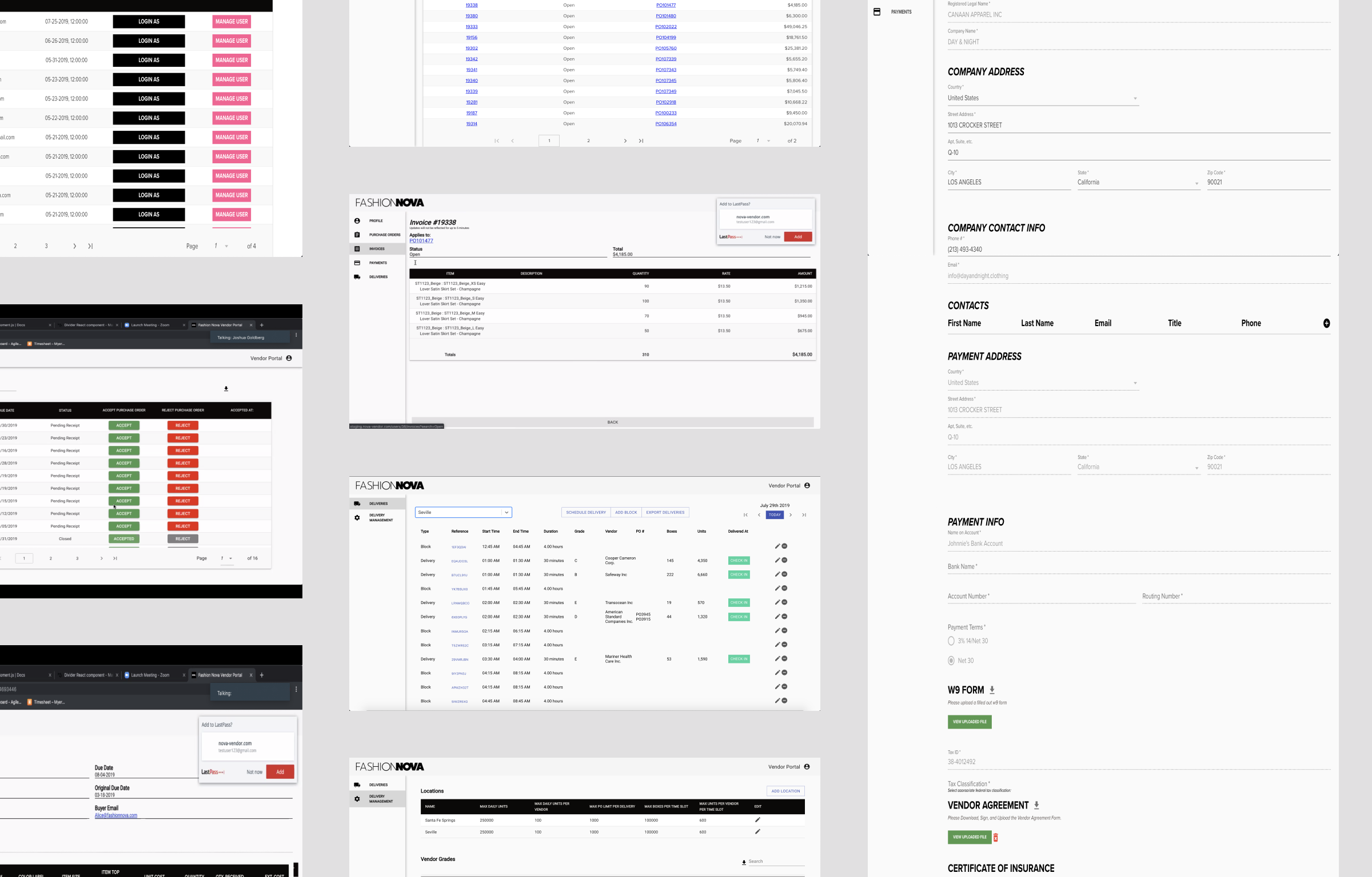
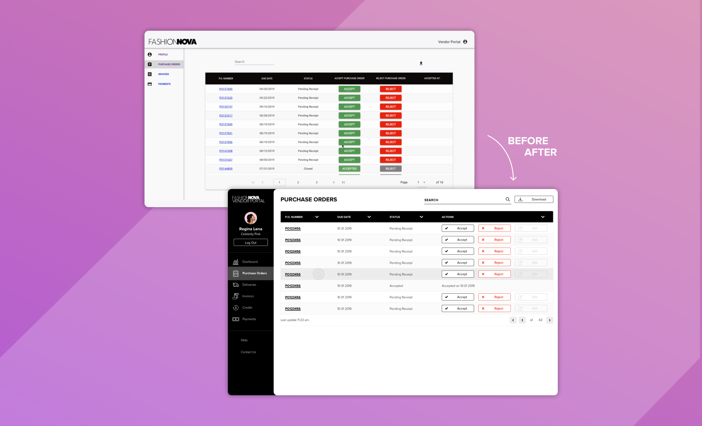
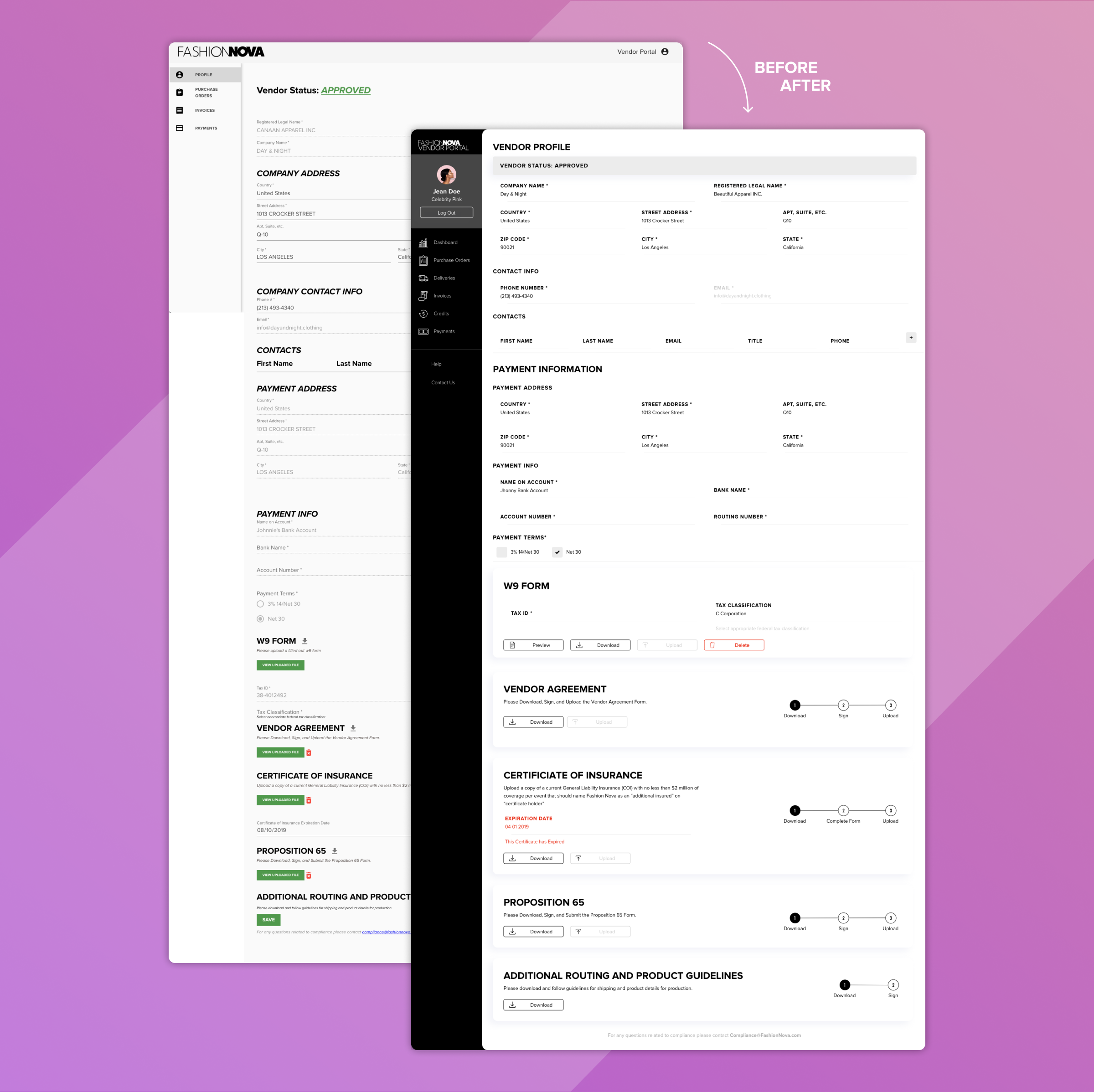
The existing portal relied on static, paginated tables users downloaded raw XML files and processed data manually outside the app. There was no filtering, no drill-down, no reporting. Every insight required manual effort. The previous website had a lateral main navigation per category, and inside each main view, tables of information were displayed over segmented pages. Users could choose to download these tables as .XML files and from then on, each manager would use this information in different ways that suited their specific needs.
SOLUTION
Replacing static exports with interactive, filterable views and a real-time dashboard would eliminate manual workarounds and surface the information managers needed to make faster, better decisions.
HEURISTIC EVALUATION
To establish a measurable baseline, I evaluated each journey against Jakob Nielsen's 10 Principles of Good Design, scoring usability, mapping edge cases and identifying technical constraints with the dev team.
My focus: Time Per Task, Probability of Failure, Error Recovery, Customer Effort Score.

SITEMAP & CONTENT REQUIREMENTS
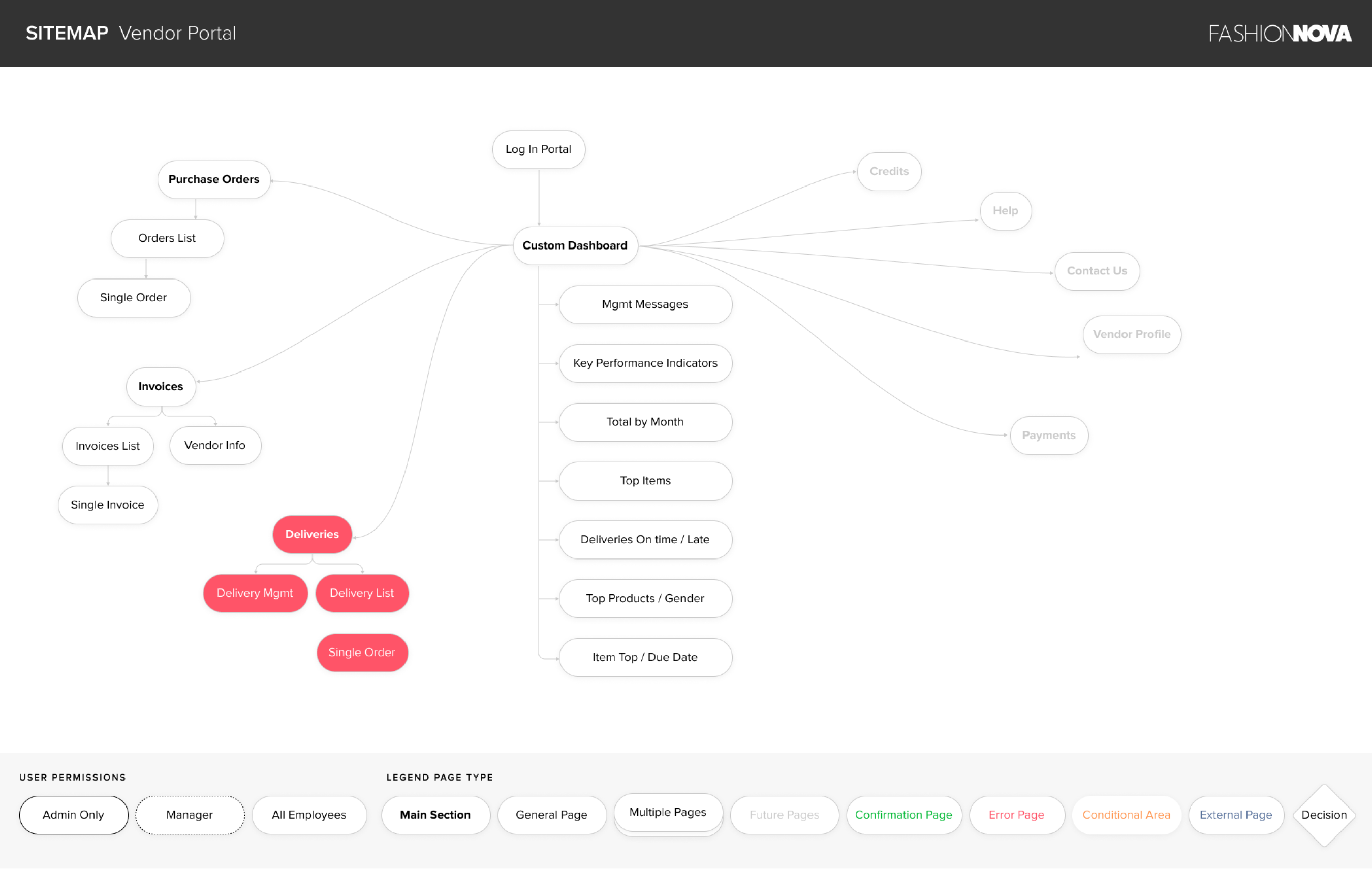
The next step was to diagram the website’s Sitemap. Part of the work was to define the main sections of the app, the sub-pages and the content requirements for each one. This documentation helped me to identify different case scenarios, possible errors, and dead ends.

DESIGN SYSTEM
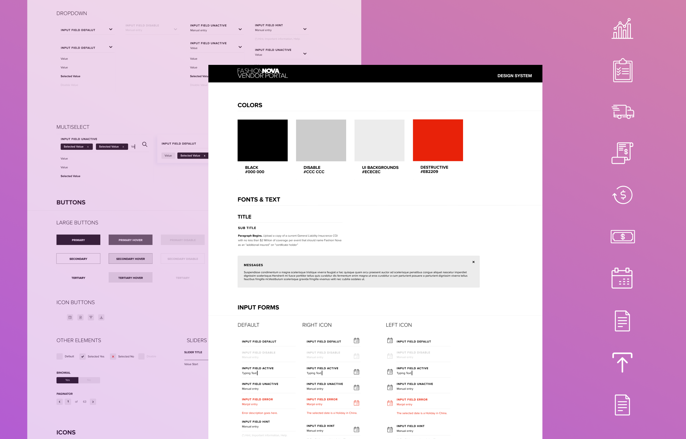
Fashion Nova had existing brand guidelines, but nothing documented for digital products. I translated the brand into a full web design system defining the color palette, iconography, UI components, interaction states, and CSS library and handed it to the development team as a shared, versioned asset.



USER INTERFACE AESTHETIC DIFFERENCES
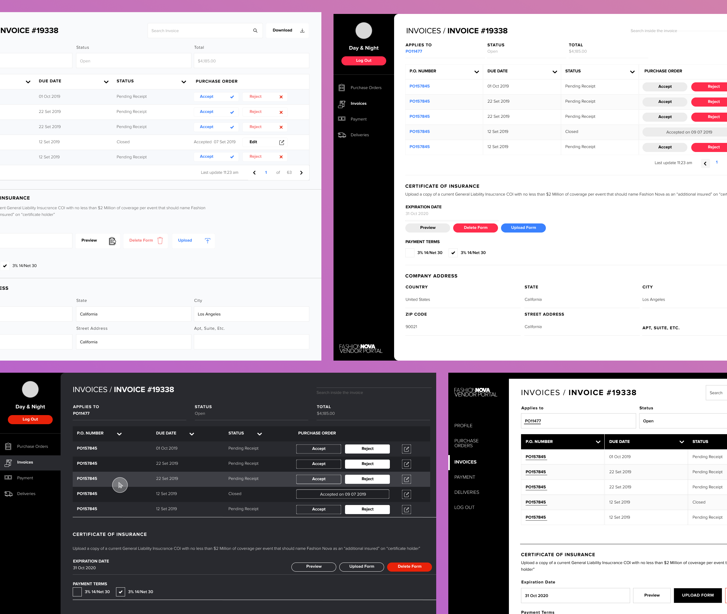
I designed multiple UI directions to test legibility across large data tables, long lists, and charts. Evaluating accent colors, typography, and color contrast. The final aesthetic was selected by the Fashion Nova Tech Manager based on structured interviews with top Vendor Managers.

ACCESSIBILITY - COLOR BLINDNESS
Color blindness is a condition of the eye which affects approximately 1 in 12 men (8%) and 1 in 200 women. Considering that most employees in Fashion Nova warehouse are men, I chose a color palette with a high contrast that would be easy to differentiate under various color spectrums.
DARK AND LIGHT MODE
User research surfaced a hypothesis worth testing: would dark mode reduce eye strain in a warehouse environment under artificial light? I reviewed academic literature on the topic. Findings were inconclusive, so I built and tested a dark mode prototype directly with users.
Testing confirmed dark mode wasn't the right fit for the environment. The decision was evidence-based, not aesthetic.

Success indicators defined at project outset: CSAT, Customer Effort Score, Average Time on Task, and Error Rate per journey. Infrastructure for measurement was scoped for post-launch implementation.
Special thanks to Dmitry, Matt, Josh, and Sherri for all their support, feedback and trust.